
Lessons of Enterprise Scale Analytics, Part 3
This month we’re continuing our series on lessons learned as our Business Intelligence implementations grow ever larger and more complicated. Last month we talked about data grain and how it influences building, usage, and maintenance decisions, and this month I’d like to engage with an idea about expanding our thinking about Analytics from Dashboard-focused to a more global perspective.
The Viz is only a fraction of the analysis
Dynamic Dashboards, full of color and shape and story (aka the Viz), are arguably the most exciting part of enterprise Analytics and Business Intelligence. They’re the first thing we think of when we talk about modern BI, and they’re the part that gets the most attention. However, visualization of our data is only a small part of the overall lifecycle of an Analytics use case. What happens both before and after the Viz can make or break not just the success of a use case, but the overall success of the implementation. .
Before the Viz
Speccing
Traditionally, a new visualization starts as a specification. My favorites are cocktail napkin visions - down-to-earth ideas straight from the perspective of the business user. Sometimes we get PDFs with plans from a thoughtful committee. More often we get an Excel spreadsheet with some kind of surprise logic or hidden assumption. The challenge here is that the language we speak as Analytics platform experts is entirely different from the language our users speak. From this point of view, developing specs and requirements can be the hardest part of any tech project. However, with good-faith collaboration, proof-of-concept builds, and a lot of listening, we can discover what’s most important about what we’re about to build.

Fig 1: Cocktail napkin, perfect for analytics brainstorming
Sourcing
How and where we gather our data matters, as different sources will have different update frequencies, security and access requirements, and potentially even radically different storage structures at rest. My favorite large builds have included CRM data, public sources like data.gov, and CSV-based Datasets with quota information all combined in different ways.What we as builders have to understand is how these inputs relate to one another, both in technical details like keys and in practical details like what kind of join reflects the real-life business application. (My article on data grain referenced in the introduction as some further thoughts on the intersection of data and business.) Doing this right sets us up to enrich the data to its fullest potential.
Enriching
This is by far the most impactful, and potentially complicated, aspect of the work we do before the visualization. Anything we can do in the data layer, we should. We can allocate the resources for computing things like aggregations and derived fields in a predictable manner, we can save processing cycles when we get to the interactive portions of the visualization, and we can enable secondary logic in the presentation layer - things like averages of averages, or including targets alongside actuals so we can compute attainment in a single query. In fact, this consideration is so powerful that we’re going to dedicate the entire final third of this conversation to challenges of the data layer.
After the Viz
Deploying
How and where we present the data has a lot of impact as well. Standalone, embedded, and mobile Dashboards empower different audiences in different ways, and bring about a variety of design and UX challenges. I’m most fond of embedding not only because it minimizes user effort - we Analysts can meet them where they’re already working - but also because record-level details give inherent context to the analytics. Which is to say: when I’m working with a standalone Dashboard, I’m almost always going to have to interact with the Dashboard to make it meaningful in the moment, but I also need extra details like labels and axes and feedback indicators, all of which make the Dashboard busier. In contrast, an embedded Dashboard has built-in context in its parent record, so we can remove some labels, simplify some charts, and focus on truly key numbers that matter to that record in that moment.
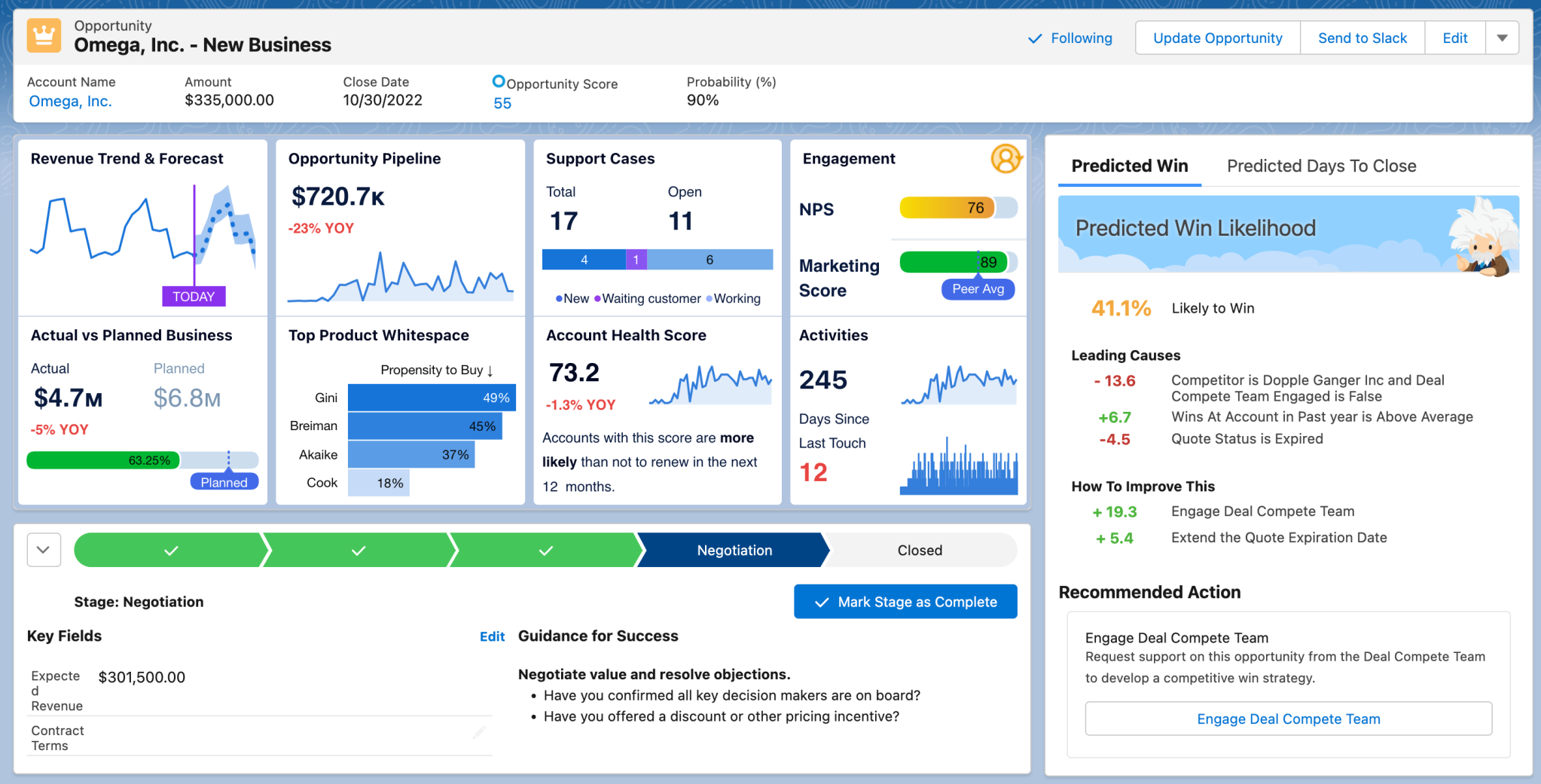
Embedded in the proper target, the simplest charts can tell impactful stories
Fig 2: Small visualizations, big context
Defending
One of my most successful builds was a “Quick Stats” Dashboard showing something like 9 KPIs representing 4 different aspects of the business. I liked this build first because we got to use all the tricks of Big Awesome Numbers that we learned from the good folks in the Tableau community at Tableau Conference 2025, and second because each large KPI included an equally large text box that explained in full detail what this number represented. My client wanted to provide something to her users that answered every question at a glance, so they didn’t have to come to her for further detail or clarification. True effective self-service for our users - if only every use case could be that bold and clear.
In truth, we analysts and builders are going to have to defend what we build, no matter what. I’ve had to learn to practice some intentional professional detachment because often what’s helpful for my client isn’t necessarily fun for me to build. It ain’t all spark charts and tab-switching animations around here. In fact, it’s mostly tables where the real power comes from the ways in which we enriched the dataset before the Viz.
Inspiring
This is both the fun part and the part that separates the great Analytics builders from the good. While engaged in ongoing feedback and iteration with our clients, the great builders always arrive with an idea. Another way we can process the data, a potential personalization, maybe a window function that illuminates a pattern we’d not seen before. As specialists and technicians we’ll see opportunities in the use case that our clients sometimes won’t. What’s important is that we bring our experience and expertise to complement the same of our clients. They’re not always going to take us up on our ideas, but we should always be bringing them nonetheless.
Building vibrant and engaging Dashboards is a fun part of my job, but it really is just a chapter in a much larger story. The vast majority of our enterprise scale builds focus on tables of enriched data and clear KPIs values, and even those seemingly simple builds hide complexity in their data layers and eventual deployment contexts. Identifying and managing that non-obvious complexity, especially outside of the central visualizations, is an expert-level skill for all analysts and consultants.
Next time we’ll continue exploring our lessons learned by chatting about why developing a deep understanding of our clients’ data models is as powerful as any technical platform skill.